
here is an in depth look at the history of edsed (formerly kompyuuta, formerly the akaepa homepage). it all started in 2002. me and my friend justin had just stopped working on our latest website failure, "poosh! online" (one of my many attempts to create a virtual pet website, which, by the way, i am still deeply interested in doing. if any of you coders out there are willing to code one up, please contact me and we'll talk! but i digress!). we had worked on a few websites (pokémon websites, to be exact) together for years, but we decided it was best to try working on our own sites for a change. i guess we were cramping each other's style or something. *shrug*
so i decided to work on my own personal website, a place where i could dump the music files and flash movies i had started accumulating since 1999 (i was roughly ten). because i was still somewhat new to HTML at the time, i started really small and with a simple free host but then eventually came to where i am today.
- version 1 (the beginning)
- version 2
- version 3 (start of flash layouts)
- version 4
- version 5
- version 6.0 (adding the journal)
- version 6.5
- version 7 (akaepa.com + hiatus)
- version 8 (back in business + the start of xanga)
- version 9 (layout with the most iterations)
- version 10 (dotlumpia.com + rename to "kompyuuta")
- version 11.0 (integration of xanga + rename to "edsed")
- version 11.5
- version 12.0
- version 12.5 (current version)
version 1 - the beginning
my very first website hosted on a freewebs account. all this version composed of was some text and my .mid files. that's basically all it was.. it wasn't very interesting, but hey, i had to have started somewhere.

version 2
this was a huge leap for me, i made myself a background image and started using something i've never tried using before: HTML tables (omg gasp). i unfortunately didn't save the layout.. so i have no preview for you. you just have to trust me when i say it was pretty slick-looking at the time. :p
version 3 - start of flash layouts (view flash)
another leap. i made this site version entirely out of flash. honestly, it could have been better, but it was my first time using flash. i personally think it was pretty good considering.

version 4 (view flash)
this is the first layout that combined HTML with flash. like the previous site version, this one looked very gray (a trend you'll see carried on for better or for worse throughout most of my other layouts).

version 5 (view flash)
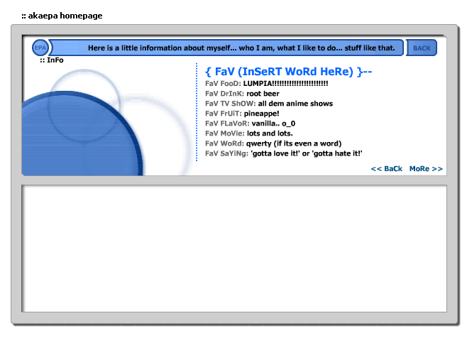
i finally started adding color to my site. it's my favorite out of all the layouts (although it may not look all too good in the picture) because of the awesome flash-work i did. i just wish i hadn't "TzYPeD LyKe DiZ, fo0" for the titles.. ah well. i was young and it was the cool thing to do.
version 6.0 - adding the journal
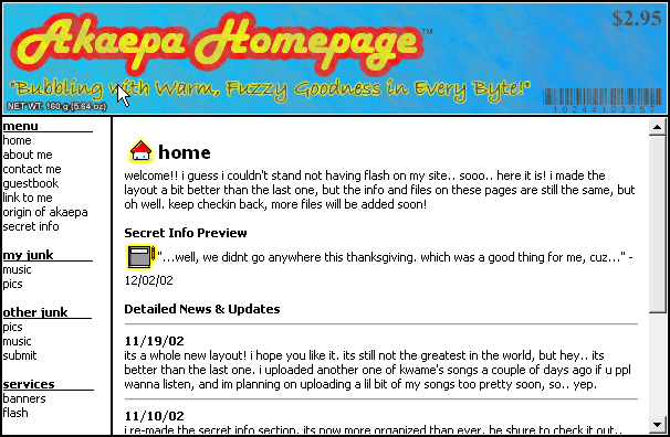 i was planning on making another flash layout for this version (you can see the unfinished file here), but since some people did not have flash on their computers (it goes to show how old these layouts are, huh?), i backtracked and did my site fully in HTML. it was clean, tidy and there was a cool javascript script i found that rotated the title images from a candy wrapper, a newspaper clipping, a road sign, and a 'vote-for-me' banner, each having "the aKaEPA homepage" photo-chopped somewhere into the picture. (i lost these images so i can't exactly show 'em to you..)
version 6 was when i opened my online journal (aka a blog). it required a password (which is why it originally was called "secret info") which i gave to only my good friends. i don't know exactly why i wanted to protect my journal entries; i suppose i thought i was going to post very deep and personal things in it. check out my "secret info" archive here.
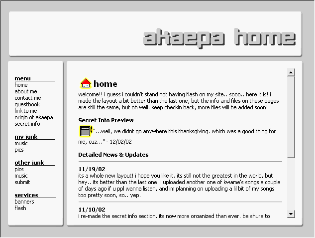
version 6.5
i started using flash again, but this time it was only for the title. although the layout looks completely different than version 6, the pages' contents were virtually the same so i didn't consider it a full version upgrade. also, i seemed to have reverted back to the same dull, gray color scheme i love oh-so-very much.
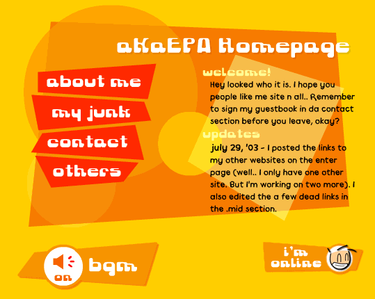
version 7 - akaepa.com + hiatus
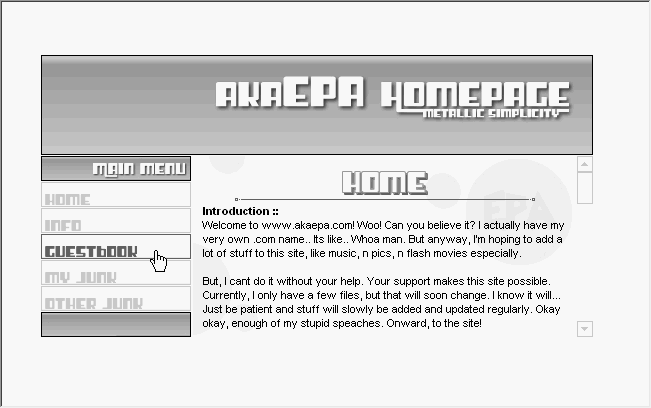 a pretty boring layout. it looks alright from the snapshot, but i never got to finish it. it was gray yet again and very blah. after making this, i stopped working on the site for about half a year. before coming up with this layout though, i tried making another flash website for version 7. it didn't turn out the way i wanted, so i trashed it. you can view what i tried to do here.
i should note that (although i hated version 7 the most out of all my layouts to date) this was the very first layout ever made for my very first domain name: http://www.akaepa.com (no longer functional). this was also when i decided to remove my journal from my main website. when my friends started getting angry because they couldn't type in the password right (you had to type in "deepfriedchickenpoowithpurplesquidsauce" in less than 10 seconds) and when i realized the stuff i was beginning to post in my 'secret info' wasn't worth password protecting in the first place, i took the password down, broke the journal away from the main site and made it into another website in itself: "akaepa journal." so i basically had two websites running: one for my junk and another for my journal. looking back at it now, i realize it must have been very confusing for my visitors. but oh well. check out the akaepa journal archive here.
version 8 - back in business + the start of xanga (view flash)
 after that half a year of trying to re-gather all the creative juice i had lost, i came up with this. it was a fairly good layout, and this was the first completely flash layout i actually finished, but people complained that it was a bit too complicated to navigate, which is why it didn't last long.
it was around this time when i first started using xanga, the website I used to use to run my journal. originally, I had set up a xanga account only to comment on my friends' weblogs, but i was drawn to the different features of xanga (the comments, e-props, friends lists, groups, etc.) and began posting. i figured i'd keep my day-to-day experiences with my akaepa journal and that i'd post super random entries on my xanga. eventually, however, i started posting more and more on my xanga and less and less on my actual journal. i guess entries of my random thoughts were a lot more interesting than my daily happenings. imagine that. it was then i decided to close down the akaepa journal altogether and post things exclusively on my xanga, which (by the way) was named edsed, a name that would later go on to be the name of this entire site.
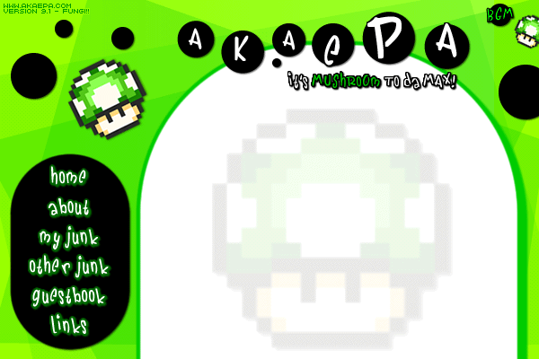
version 9 - layout with the most iterations (view page)
instead of writing up a small summary of this version, my past self decided to make a whole page dedicated to this green, mushroom-ified layout. why? honestly, i don't know.. It isn't too special. still, it took me a good amount of time to write up, so go and check it out by clicking "view page" above.
version 10 - dotlumpia.com + rename to "kompyuuta" (view website)
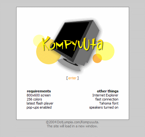 the mushroom layout was really cool for a little while, but eventually (like all my other layouts) i got tired of it, so i decided to change it. it was about at this time when i decided that to drop the un-cool alias "akaepa". because of this, i changed my domain from the confusing and hard-to-remember "www.akaepa.com" to the cooler-sounding/looking (although admittedly still pretty confusing) web domain name: "dotlumpia.com."
with this domain change came a name change of the website. it was called "akaepa homepage" after all, and i wanted to rid myself of that ugly acronym completely. "kompyuuta" was what I ended up calling my it, since the layout resembled a computer desktop, complete with desktop icons, a recycle bin, and even a start menu. it was a good website, but i found it was extremely hard to update, so it didn't last too long. that the site has for the most part remained intact ..for archival purposes, i guess. so feel free to browse.
version 11.0 - integration of my xanga + rename to "edsed"
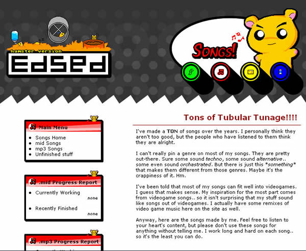 the biggest change for this version would definitely be the merging of my xanga and my website. like i mentioned before, my journal/xanga and actual personal website were two separate entities for the longest time. over time, my xanga seemed to overshadow my main site in popularity..
to remedy this, i integrated my xanga layout by matching it with my main website, hopefully getting more people to look at my actual content (like music and flash movies) as opposed to just my blog entries. i trashed the whole "virtual desktop" stuff so the name "kompyuuta" obviously wouldn't be able to apply to the site anymore (plus after looking at it, i realized that "kompyuuta," like "akaepa," was a pretty horrible name), so i decided to keep my xanga title, "edsed" as the name of my entire website. the site name has stuck ever since.
version 11.5
i then got tired of the overly graphical, and somewhat tacky, hamster-like layout and decided to change my layout yet again. version 11.5 became a reality. the pages of the site remained the same as the previous version, however the headers and menu items were changed to be a bit more sleek and simple (much like what i did for version 6).

version 12.0 (view website)
 while version 11 was a perfectly fine layout, i found that visitors were still confused as to how to navigate the site. even with the addition of a sitemap, many still complained about the complicated links and slightly confusing layout.
because of this (and the fact that xanga introduced an interesting new web 2.0 way of editing layouts), i began working to make a layout that would be as simple as possible to search through. the layout was stripped of anything too fancy and was color coded (like version 11) to show users what section they were currently in.
another reason for updating the layout was for me to kick myself into gear; updates were coming in fewer and farther in between, so i figured an updated layout would help motivate me to update more regularly. it totally didn't work. :) this version of my website is archived for all to see, but there of course will be the occasional broken link here and there.
version 12.5
this layout is actually the culmination of all the things i learned in an 'introduction to internet' course (don't ask.) at, uc irvine, the college i go to. honestly, the class taught things i already knew, but the professor helped me streamline the version 12 layout even further; i've stripped down things even more for this one; i've made the navigation buttons much more pronounced and user friendly. another new aspect of this layout is that it is made completely in dreamweaver. before, i manually coded my website and while i usually could get the job done, dreamweaver made things exponentially easier to do. good times!
i made the choice during this layout version to switch over from my xanga to tumblr. i've been looking for a better blog host for a long time now, but none of them seemed to fit what i wanted to do. i spent an entire week hand-moving all the entries from my xanga to my tumblr account, but it was totally worth it; the service is simple and straight-forward, there are no ads, and most importantly, it is completely customizable to match the rest of my website.